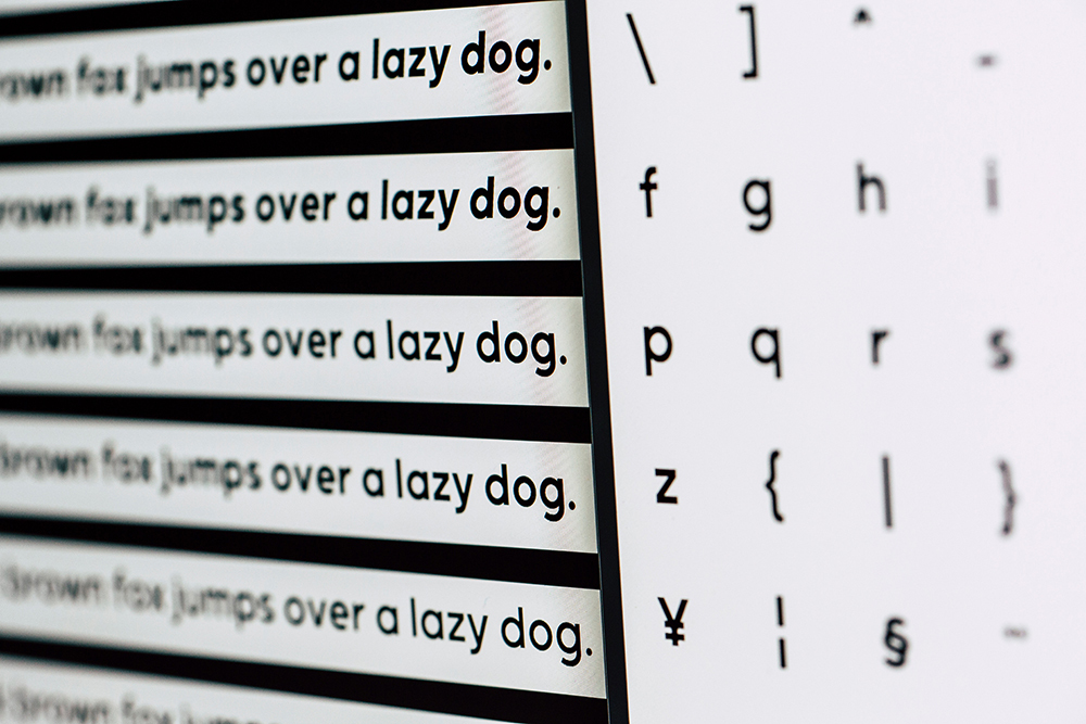
What do we mean when we talk about accessibility in fonts? Font consideration for print and web design is a crucial step in the design process. Some fonts are more legible than others, and that is especially true for people who have visual, print, or learning disabilities. We have all probably heard that sans serif fonts have better legibility in web and serif fonts have better legibility in print. Accessibility in font goes beyond this idea and modifies it for people with vision, reading, or learning difficulties.
Research has shown that the way text is presented is very important for the reading comprehension of people with dyslexia. According to a study conducted by researchers Luz Rello and Ricardo Baeza-Yates, good fonts to use for dyslexia include Helvetica, Courier, Arial, Veranda, and Computer Modern Unicode. These typefaces are set wider and take up more space on a screen or paper. Their study found that “sans serif, monospaced, and roman font styles significantly improved the reading performance over serif fonts.”
According to Simon Garfield in his book Just My Type: A Book About Fonts, Comic Sans and Trebuchet are also thought to be suitable fonts for teaching dyslexic children because “their easy, unthreatening clarity [proves] far more accessible than harsher and more traditional fonts.” New fonts have also been created with dyslexic folks in mind. Fonts like OpenDyslexic and Dyslexie were created specifically for people with dyslexia. Every letter character in these fonts is designed to look subtly different, therefore making it easier for people with dyslexia to read.
According to Carmen Willings, increased legibility in font for those with print or learning disabilities is based on three things: point size, font selection, and adequate spacing. When possible, using high-contrast colors together can increase the legibility of the printed text. Willings goes on to say that using white or light yellow letters on a dark or black background, or dark letters on a light or white background can also help individual letters stand out from each other.
Typefaces can vary greatly within the same point size, and it is important to take into consideration which typefaces are easier to read at what point sizes versus others. Getting text to be legible for low vision readers in print as well as on the web is about making the letters look as different from each other as possible so they can be distinguished from one another.
Willings also says that text which places words or letters too close together also creates legibility issues for those visually impaired. Sometimes, giving the words more room on a page can help distinguish them from one another and make the type easier to read. Text with words that are too close together creates a wall of black text, something to be avoided even when we aren’t talking about accessibility.
These considerations for legibility in typefaces will not work for everyone. These considerations are used as guidelines for aiding people with learning, visual, or print disabilities. There are not many studies that look into this, and more research definitely needs to be done to gain new insights and inspirations for change in typography and design.

