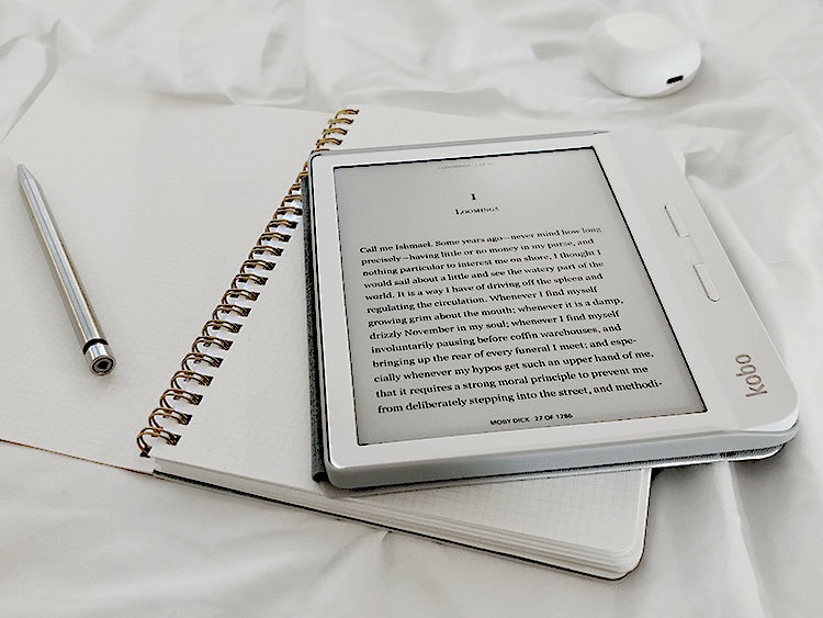
You may have noticed that whenever you read an e-book the layout of the pages is slightly different from a print book or a PDF. It might be that the images are not in the same place or that the table of contents does not have page numbers. Have you ever wondered why this happens?
In this blog post, I will explain the reasons behind e-books looking different from print books. I hope to make you understand what an e-book is and what designing one implies. And maybe next time someone complains about something in their e-book, you will be able to find the reasons behind the designer making certain decisions.
Before going into the specifics, though, let’s start from the basics. An e-book, as defined by Merriam Webster, is “a book composed in or converted to digital format for display on a computer screen or a handheld device.” In the book production process, both the print book and the e-book are generated from the same file, which is the finished manuscript with its final interior design. The difference is that to generate an e-book the file is slightly modified. But why is the final version of the book modified? It is important to keep in mind that a print book and an e-book are completely different, mainly because of how the final product looks and how it will be read by the readers. Therefore, the goals when creating the final file are different.
For a print book, the result is a static document, usually a PDF, that will be printed to become a book. This product is considered to be a fixed format because it cannot be modified by the readers. Any reader will see the same layout, font family and size, page numbers, margins, and spacings, for instance. The publisher has complete control of how the final book will look like and how the readers will see the pages when reading the book. Therefore, the goal when creating the print book is to end up with something aesthetic and well-designed.
On the contrary, for an e-book, the result is a flexible file that will be downloaded and read on different devices. Readers might be using a computer, a tablet, a phone, or an e-reader to open their e-book. Because of the variety of devices and their different sizes, e-books are designed to change and adapt to various interfaces. Differently than with print books, publishers lose the ability to control the final appearance (font family and size, widows and orphans . . .) and aim, instead, to create files that are as flexible as possible, in other words, that can be properly seen and read on any device. Because of its flexibility, readers win control over their reading experience and how they want their text to look. They can change the font family, the font size, and the background color.
As we have seen until now, the reason why the e-book looks different from the print book is that e-books are specifically designed to be flexible and adapt to different devices. This is their goal when being created. In order to accomplish the final result, the focus when working on building an e-book is different than when designing a print book, and it lies on the following elements:
- Making sure that everything appears in the correct order (titles, paragraphs, images, tables, footnotes, etc).
- Deleting print references, such as page numbers and references to page numbers.
- Placing and anchoring images to the place where they should appear, which is usually as close to the print version as possible. And resizing them along with the text.
- Adding hyperlinks. This can be a good technique to replace page numbers. It can be used in the table of contents, but also in page references throughout the text.
All in all, the layout of an e-book is different from the layout of a print book because they are designed with different goals and perspectives. When designing a print book there is a lot of attention to the appearance, which is completely fixed. In contrast, when designing an e-book, the ultimate goal is to make the text adapt to the screen and let the readers have the freedom of choosing how they want to view their text.

